Create visualizations
Ask the AI assistant to create charts and diagrams to visualize your data. This is especially useful for presentations, reports, or sharing insights with stakeholders.
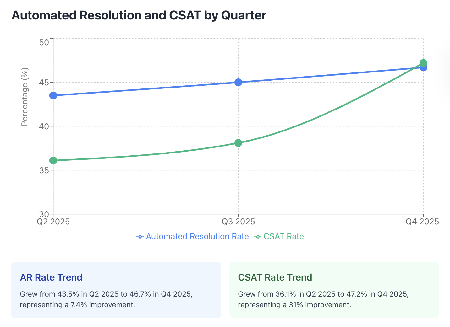
Example: AR and CSAT trend chart
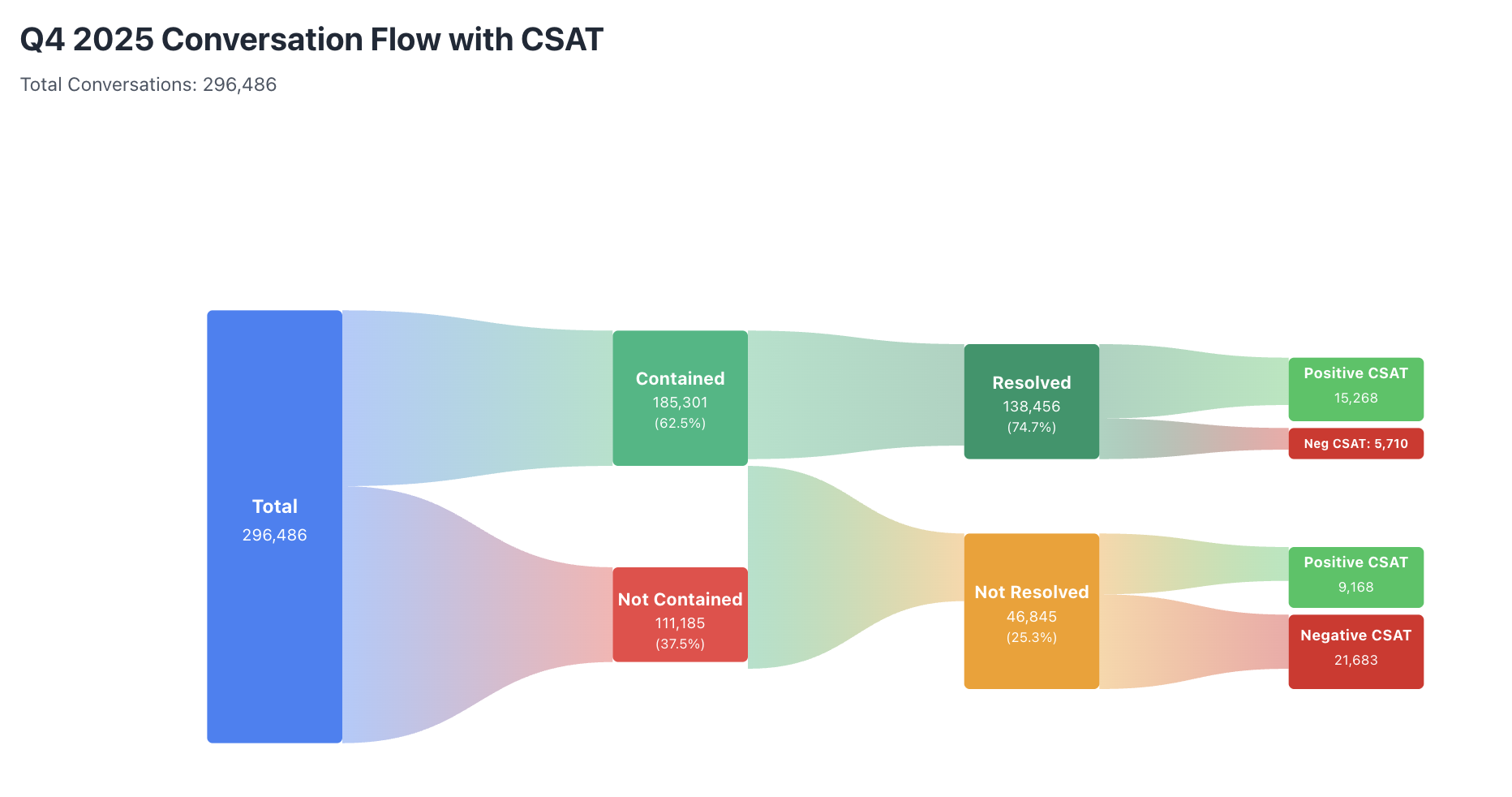
Example: Conversation flow diagram
After the chart is generated, refine it with follow-up prompts like “adjust the y-axis to start at 30%” or “annotate the week we launched the new playbook”.