Customize your bot's branding
Bot customization overview
When you customize your bot’s branding, you can make your bot’s appearance fit seamlessly into your website, from adding your brand colors to making an eye-catching chat button. You can watch this video for an overview and an example, or keep reading to learn about how you can customize how your own bot looks.
Accessibility
-
Chatters can navigate the entire chat with a keyboard and/or screen reader.
-
Depending on your brand color, the chat will automatically adjust to ensure color contrast between elements on the page. Chat content will always have sufficient contrast.
Access branding customization options
To customize your bot, head to Settings > Bot Setup > Bot Customization.
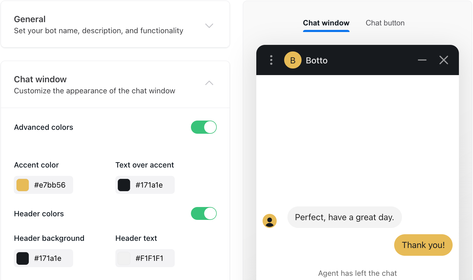
There are four categories you can customize. Depending on your organization’s subscription package, you may also see additional Advanced branding features.

General settings
-
Bot name – multilingual
-
Bot description – multilingual (optional)
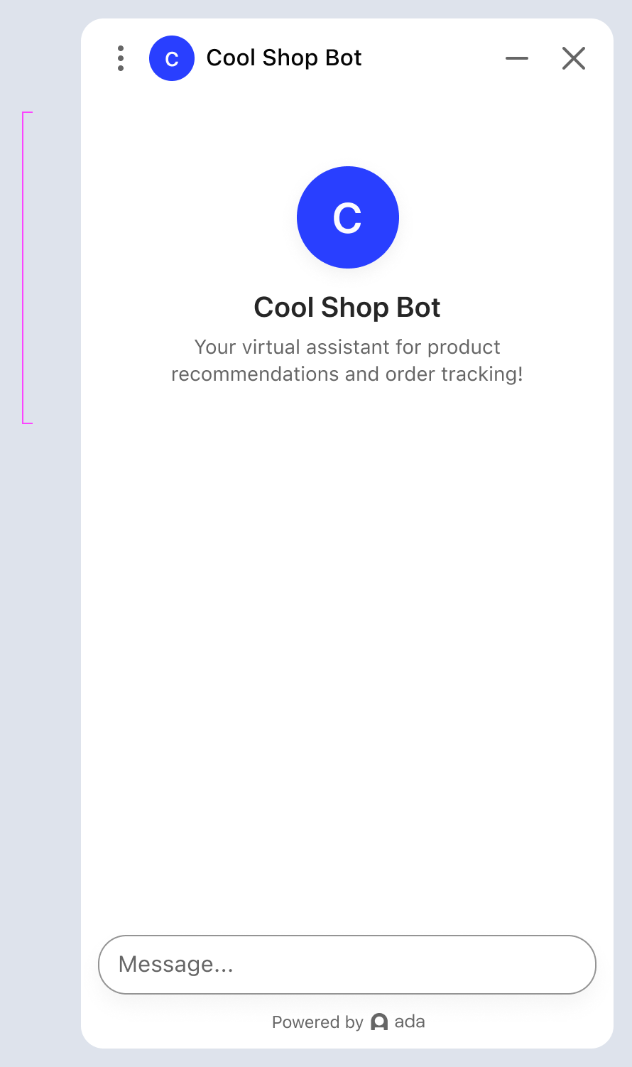
The bot description is a component that appears at the start of a new chat to help set the context. You can use this instead of adding text to the Greeting Answer. The component consists of the bot avatar, name, and short customizable description (max 80 characters). You can turn the bot description on/off in Bot Customization > General, but the feature will be on by default.
-
Offer predictive suggestions
-
Show privacy policy link
-
Show Powered by Ada logo
-
Enable sound by default
-
Allow chatters to email transcript
-
Allow chatters to download transcript
Chat window settings
-
Advanced colors – Allows you to choose custom text colors in addition to background colors. If this setting is toggled off, when you select a background color, the text on it defaults to either black or white, depending on which provides the best contrast.
-
Accent color
-
Quick reply button orientation
- You can choose whether quick reply buttons are stacked on top of each other, or side-by-side in a scrollable carousel, and choose different settings between desktop and mobile browsers
-
Bot avatar
-
Live agent avatar – Only available for bots with certain Ada Glass integrations
Chat button settings
-
Round button option
-
Icon
-
Color
-
Size
-
Fallback message settings
In the rare event that chat services go down, you can create content to show up for customers instead of the usual web chat window.
-
Language
Choose the language to create fallback text for.
-
Icon and message
Ada provides you with a default error icon and message that you can customize or override as necessary.
-
Button labels and URLs (optional)
By default, there are no action buttons provided for chat errors; however, you can add links to alternate actions or resources if you wish. In the Button label field, enter the button text to display; and in the URL field, enter the URL that the button should open when clicked.
Advanced branding features
This feature may not be included with your organization’s subscription package. For more information, see Ada’s Pricing page, or contact your Ada team.
Header color
With advanced branding, you can customize a header color directly in the the dashboard, in Bot Customization > Chat Window. This is independent of the brand color used throughout the rest of the chat.
Theme (dark mode)
You can choose from the following settings in Bot Customization > Chat Window:
-
Light mode
-
Dark mode
-
Automatically default to user’s device
Chat bubble and styles
You can choose between 2 ways of styling the chat in Bot Customization > Chat Window:
-
Rounded corners
-
Rectangular corners
Configurable font sizes
You can choose between 3 font sizes in Bot Customization > Chat Window:
-
Small (14px body font)
-
Standard (16px body font)
-
Large (17px body font)
Chat button with custom text
A custom text button option with customizable icon, color, and text (max 18 characters) can be found in Bot Customization > Chat Button.